The Philadelphia Phillies are one of nine teams to receive a City Connect uniform for the 2024 season. Each of them has now been unveiled, showing that this year’s crop of alternates is perhaps the worst of the bunch so far.
While each of the past four seasons has given fans plenty of forgettable and ugly uniforms, this year lacks an elite uniform that everyone will want to see for a long time. The Washington Nationals, Miami Marlins, and Chicago White Sox all had City Connect uniforms that were recognized as great at the moment and have stood the test of time, even being used in future seasons. It’s to imagine any of the new City Connect threads will leave the same legacy.
Here is the definitive ranking for all nine of the 2024 City Connect uniforms, starting with the best and ending with the worst. Each uniform will be in a tier and given a ranking within that tier.
City Connect Rankings
1A. Tampa Bay Rays (#1 overall)
The Rays’ uniform doesn’t stand out a ton from the 2024 City Connect crowd since it’s a dark get-up like most of the rest. But on its own, it works super well, making the vibrant neon colors pop even more. The Rays effectively branched out while keeping its new aspects tasteful.
While the texture of the uniforms is certainly different and may need some time to get used to, it helps this uniform stand out. It might have been a good move to make the words and numbers a lighter color to make them stand out more, as both can be tougher to read. Aside from that, this uniform is everything you would want from an alternate kit.
The on-fire wordmark across the chest and the multiple new logos — all of which are awesome — make this uniform very distinct. The wordmark going with the name of the city for the first time in a while and using the same font and slanted angle as the franchise’s original jersey blends the past and present together in excellent harmony. The hat is perhaps the best of the new City Connect bunch.
The skateboarding stingray has rolled right into one of the top spots of these rankings with a sick 180 ollie. If any team uses their 2024 City Connects for another season, it should be the Rays.
1B. Toronto Blue Jays (#2 overall)
The Blue Jays went back to a black uniform for the first time in over a decade but released something that doesn’t resemble any other past uniform. The font, logos, and colors are rehashed into a distinct yet familiar uniform design.
Toronto’s skyline is splashed across the front of the jersey and inside brim, easily connecting the team to the city. The Canadian Maple Leaf now sits in the front of the hat with a new “T” logo that is also used on the sleeves of the City Connect jerseys. The hat logo is, admittedly, somewhat bland. But it does at least stand out from what the team has had going. These uniforms do an excellent job of recycling old aspects of the team’s identity and its city into a new look.
While perhaps a lighter blue color might have added some more contrasting pop, these uniforms are pretty solid. The Jays wouldn’t be making a mistake to keep these around for a little longer.
2A. Los Angeles Dodgers (#3 overall)
MLB wasn’t kind enough to release an explainer video at the time of this writing, so click here for more details about LA’s new uniform.
The Dodgers are the first team to have multiple City Connect uniforms. After making essentially the same uniforms they always have but with blue instead of white or gray, the Dodgers made something that looks way different. But these look more “fine” than “good.”
The numbers on the back being above the players’ last name is one thing but having them be cut off at the bottom seems unnecessary. The splatter on the jersey is different but not the biggest element that ties everything together. The split, multi-color font on the front is a big step in a new direction, as is the dark blue hat. While mashing two different logos together seems like cutting corners to make something new, it works for the Dodgers, whose iconic “LA” logo and cursive “D” used in Spring Training mesh pretty nicely.
The fact that these are near the top of the rankings says more about this year’s City Connect uniforms. These are fine but it’s hard to imagine they stick around.
2B. Cleveland Guardians (#4 overall)
A relatively conservative approach paid off decently in Cleveland. The Guardians didn’t try anything too crazy but did branch out pretty noticeably from their normal uniforms.
Taking inspiration from the Guardians of Traffic statues makes all the sense in the world but going with just “CLE” on the front feels like the Guardians left something on the table regarding their City Connect jerseys. Even just sticking with Cleveland would have been better than the super-shortened abbreviation that we see on the scorebugs.
The Guardians sticking with their normal logo for the hat is both a disappointing missed chance to make something new and a distinct change from other City Connects, which have turned to designs that stick out more from the typical caps. The team put a lot of focus into the numbers and jerseys having meaningful patterns but because they are each just one color, it takes a keen eye to notice and appreciate.
Still, in the end, the stripes down the side of the jersey and pants and the color scheme make for a respectable uniform that fits with several eras of baseball.
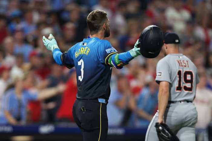
3A. Philadelphia Phillies (#5 overall)
The Phillies’ City Connect threads strayed far away from the typical red and white that the franchise has come to be known for. The bold design and use of blue and yellow give it a very distinct vibe, though one that took some time to get used to.
Everyone in Philadelphia, perhaps tortured by nightmares of the Eagles’ old light blue and yellow uniforms, was worried about how the Phillies would look in a uniform featuring the colors of the city flag. It turned out that they would be used as supportive colors on a dark uniform and hat.
Using a literal blue collar to signify Philadelphia’s hard-working nature is a nice touch, as is the patch on the sleeve that pays homage to the LOVE statue. The new hat logo is super nice and makes for a spectacular fit on the all-black hat. The gradient and font on the City Connect jersey are still a lot to take in but, paired with the hat and pants, create a uniform that works pretty well altogether. The hats are up there with Tampa Bay’s as one of the best in this year’s new additions.
At the very least, the Phillies deserve some respect for trying something so new, even if it isn’t an instant classic.
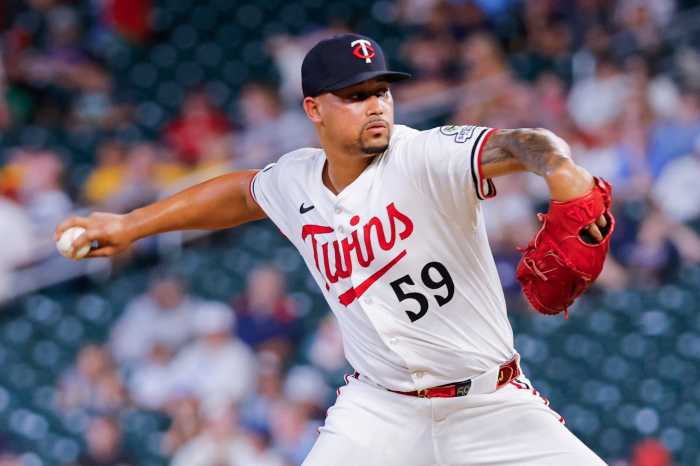
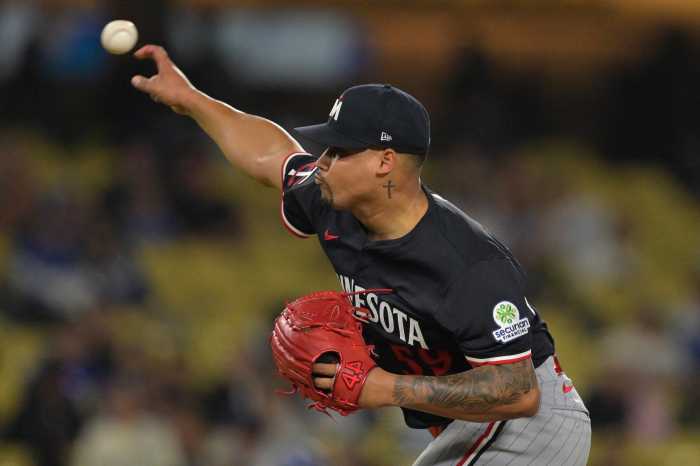
3B. Minnesota Twins (#6 overall)
Nike really likes itself some blue and yellow, huh? The Twins are the fifth team to have blue and yellow be the primary colors of their City Connect threads.
The Twins played heavily on the “Land of 10,000 Lakes” nickname, making a uniform that looks like water and etching “10,00 lakes” onto the side of the hat. The front of the jersey is empty aside from a logo in the top right (and the swoosh), which does a great job of letting the ripple design itself do the talking. Each of the new logos — the front-of-jersey one, the sleeve patch, and the hat one — is pretty nice.
These City Connect uniforms are certainly different from normal Twins get-ups and connect the team to its home. However, they rank in the middle of the pack because the all-blue look is a little too much and the color scheme, while appropriate for the team, is being run into the ground.
3C. St. Louis Cardinals (#7 overall)
It’s crazy to think that these jerseys will be the first red jerseys the Cardinals wear for the regular season.
Even though the three-letter city abbreviation is overdone in this year’s City Connect threads are overdone, the Cards pushed it up to the cap and went with a different city nickname for the jersey. Technically, “Lou” is another three-letter abbreviation but it’s used more like a title or a genuine nickname than just the shortening of the city.
The squiggly, faint pinstripes and usage of a font that harkens back to the franchise’s early days make for nice touches. The sleeve patch is probably worth slapping on hats and shirts, as it’s a really sleek design with multiple nods to the city. But overall, these uniforms don’t branch out too far from what they normally wear. It looks better than some but doesn’t rank as high because they didn’t dare to be different, which is the point of these uniforms.
Swinging and missing is embarrassing but the Cardinals didn’t exactly swing for the fences here. These uniforms encapsulate the energy of a bunt; they’re not bad but also aren’t very memorable.
4. New York Mets (#8 overall)
The Mets teased purple in the trailers and promotions for their new uniforms and only ended up using it in the finer details of a uniform that’s black, white and gray. Imagine a friend invites you to a BBQ night only to serve a single hamburger slider.
Putting aside the weirdness of having gray uniforms for the home team, this get-up has a lot of nice details. The bridge on the cap adds a nice pop to an otherwise colorless lid. The shade of purple, pinstripes, and sleeve patch are all nods to the city’s subway system. They took advantage of the Yankees not doing a City Connect and tried to make a uniform that all of New York City could get behind.
While these uniforms do have plenty of homages to the city, they’re just kinda bland. Concrete gray was not meant to be a high-profile color for a baseball jersey. The hints of purple did a great job of foreshadowing who would turn their season around with a memorable first pitch and subsequent winning streak — that would be Grimace, of course — but otherwise, these uniforms are not all that good.
5. Detroit Tigers (#9 overall)
As an ode to its “Motor City” monicker, Detroit chose tire prints to run down its City Connect jersey. It’s fitting for a uniform worth stepping on and paying no mind to. These threads STINK.
Is the best part about these the tiger on the underbill? It might be, because nothing else about this uniform is all that interesting. The only contrast to the black and darker shade of blue are the boring, all-white font on the hat and across the jersey and the patch on the sleeve that, while containing plenty of historical and cultural elements, is mostly just a square turned on its side with the Tigers’ Old English D and the number one.
Javier Baez is in awe of how badly the Tigers whiffed with these. There have been a lot of bad City Connect threads over the years — the Pittsburgh Pirates and San Francisco Giants come to mind — and Detroit has a contender for the very worst one.
Photo Credit: (AP Photo/Derik Hamilton)