The 2024-25 NBA Nike City Edition uniforms for every team leaked across social media last week. This is the eighth year that Nike has worked with teams to create a uniform representative of the city and the people who live there. Here is a ranking of every 76ers’ City Edition uniform from worst to best.
No. 8: Boathouse Row (2020-21)
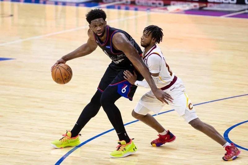
It is very fitting that the worst City Edition uniform the 76ers have worn was the one that Ben Simmons had the most say in its design. The Boathouse Row uniforms are a cool concept, but the execution is objectively terrible.
The actual depiction of Boathouse Row cannot be made out from a distance even as it wraps around the entire jersey top. The numbers above Boathouse Row, but the city name below is clunky. On the backside, the player’s name is also on the bottom, which is not uncommon nowadays but just looks weird. The little “TTP” thrown in there was a fun touch.
But the coup de grâce for these uniforms is the fact that they are black in color but were not the return of the Allen Iverson-era uniforms that the fanbase has been clamoring for. With recent news that those uniforms will most likely be returning next season, the Boathouse Row uniforms can officially be discarded and forgotten.
No. 7: Reading Terminal Market (2023-24)
Nobody should have to think when looking at a uniform. We just want to know the team’s name and the city they play for. Instead of either of those things, this is the second 76ers installment to say “City of Brotherly Love.”
Of course, people know that is Philly’s nickname, but they are impossible to read when the players are in motion. With “City Of” and “Love” in a small white script, the only word that stands out is the blocky “BROTHERLY.” Just not great.
No. 6: Declaration of Independence (2017-18)
These uniforms were part of the inaugural batch of City Edition uniforms and definitely look like they were made intentionally not to make people angry. Sometimes, you know from a pilot episode of a TV series whether the concept will work or not. Same thing here with these uniforms. Nike gave themselves a chance to see season two.
Cream-colored uniforms are awesome. But that is the only thing saving these from being the worst of the bunch. The font is supposed to be reminiscent of the signatures on the Declaration of Independence, which, without knowing that, could never possibly be guessed. They miss the mark with the whole “City” thing.
No. 5: ‘Rocky’/’Creed’ (2018-19)

The best word to describe these uniforms would be unique. These were the second City Edition uniform worn by the team and the only one to not state the team’s name or city across the chest. As mentioned earlier, we should not have to think about uniforms when we look at them, and in that regard, these are definitely the worst of the group.
The Chicago Bulls had the only other 2018-19 City Edition uniform with a similar take, but Chicago’s flag inspired their jersey. It was much more recognizable as being a uniform for a Chicago team than it was for a Philadelphia team. The Philadelphia 76ers historically do not wear nor incorporate gray. The stars have always been a background element to the uniform, not the main drawing point.
Oh, and who could forget watching the uniforms start out a light gray color in the first quarter and slowly become dark gray with sweat as the game went on?
No. 4: Philly’s Rich Basketball History (2022-23)
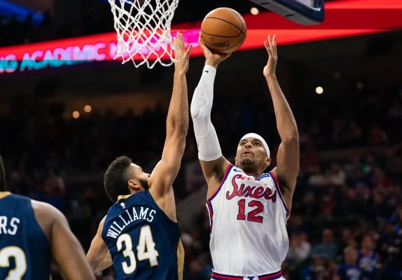
These are the first uniforms to say “City of Brotherly Love,” and they are done much better than the aforementioned Reading Terminal Market uniforms. Even though “City of” is very small, “Brotherly Love” is big and bold enough to actually convey that these represent Philadelphia.
The white uniform with thin red trim is a classic look. Simplistic enough to feel retro while sleek enough to feel modern. There is not much to this uniform, and that is a big reason why it is one of the better ones.
No. 3: The Spectrum—White Edition (2024-25)
Recycled uniform concepts usually end up going very poorly. That is not the case with the white Spectrums. They recycled the correct uniform from their City Edition rolodex (more on that later), and they turned out beautifully. These will be worn this upcoming season, and hopefully, they will have an alternate court design accompanying them.
The retro font used is beautiful, and the red letters work very well with the white uniform base. The color block side panels give the uniform its own character. They looked good before, and they will look good again.
No. 2: Liberty Bell (2019-2020)
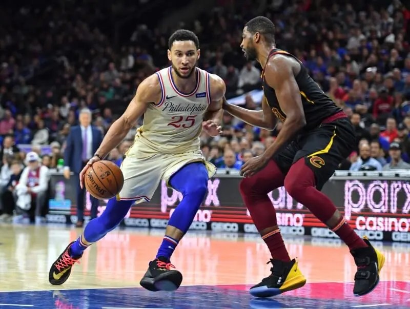
These uniforms are timeless, even though they were only worn for one season. Of all eight City Edition uniforms, these are the best embodiment of Philadelphia.
Spelling the entire city name across the chest in script is absolutely beautiful. The slightly angled and upscaled numbers that flow with the script work perfectly, and cream was the best possible choice for the base color.
But the best part about these uniforms is the shorts. Incorporating the stitch pattern and panels to resemble the crack in the Liberty Bell is not only ingenious, but it is easy to read. When you look at the uniforms, you know it is the Liberty Bell. Just cool.
No. 1: The Spectrum—Original (2021-22)
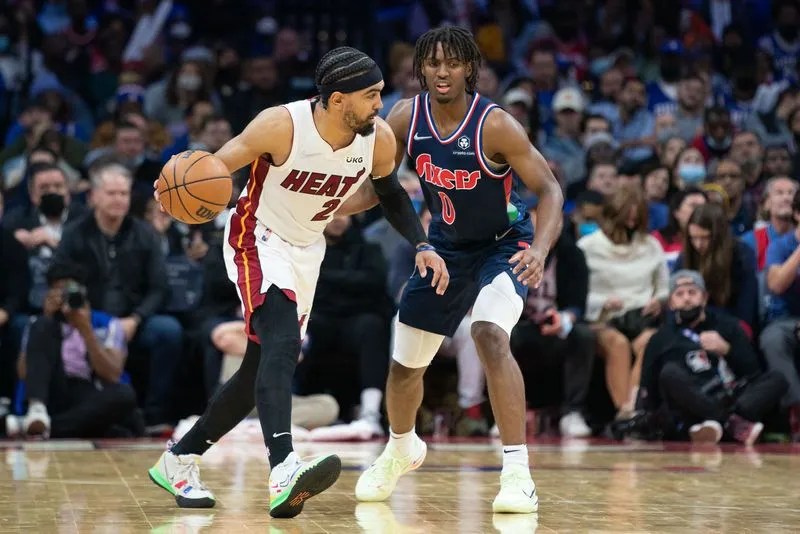
These are hands down the best City Edition uniform the 76ers have ever had. Everything about the uniform is great and was universally loved; that is rare. With the Spectrum-inspired court to go with them, these were some of the most memorable uniforms the 76ers have ever worn.
The same red letters and color block side panels that pop off of this year’s white edition somehow look even better on the navy blue base. These uniforms have aura. Good on Nike and the Sixers for bringing them back instead of trying something else that probably would have missed the mark.


