The other day, PSN’s head honcho, Liam Jenkins, wrote about how he thought the Flyers’ new Reverse Retro Jersey’s were gorgeous.
I respectfully disagree. After seeing them unveiled, my reaction was a simple, MEH! Good, but not great. If you haven’t had a chance to see the design here you go:
Let me start by saying that the Flyers organization has been tinkering with different uniforms for the past few years. They changed looks on four occasions, after ditching the Reebok Edge redesign for good following the 2010 season.
Who Knocked it Out of the Park?
First, let me say that both the Colorado Avalanche and Carolina Hurricanes have hit the jackpot with their jerseys, bringing back my two personal favorite logos of all time:
I agree with Stephen Whyno. The Avalanche goes back to their Quebec roots with this Nordique inspired jersey. The logo is simply amazing. The Fleur de Lis helped make the Nordique jersey one of the best ever, paying homage to their French heritage.
The Avs could have simply brought back the original Quebec Nordique jersey. That by itself would have been amazing! However, by incorporating their current colors, The Avs really hit the mark and added to that “reverse” portion of the Adidas Line. Choosing the Nordique path over the Rockies was also the right choice. The Avs, in my opinion, have the best of the new jerseys. With Christmas and the Holidays around the corner, um… Mrs. Stinger, hint, hint!
Canes a close second
Another gem, and a close second to the Avs, go to Carolina as they go back to their roots in Hartford. The simple design plays off of the original jerseys. The base is a light grey gives it the “reverse” touch. Unlike Colorado, had the Canes tried to keep their current colors, it just wouldn’t work. The Whalers need to keep that fantastic green and blue combo. This jersey is just clean and beautiful, and of course, that logo is fire!
Back to The Orange and Black
Let’s look at some of the positives of the new Flyers look. First, they pay homage to the jersey design that I grew up with during the 80s and 90s. The jersey brings in the retro, that takes me back to when I first fell in love with the game. Back to the teams that consisted of late spring hockey and deep playoff runs.
Second, the jersey ditched the off-color nameplate. In 2008 when the Flyers introduced the new retro third jersey, it sported the white nameplate. This was a really cool throwback to when the Flyers first put nameplates on their orange jerseys. The nameplates were added for TV as the Flyers originally did not have names on their orange jerseys. Because of this, the Flyers only had white nameplates on hand, therefore the white nameplates were added to the orange jerseys for the 1975 Stanley Cup Finals. The Flyers went a little overboard using the off-color nameplate. It is good to see they ditched it here.
Negatives:
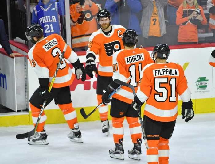
I am going to sound nitpicky here, but I don’t like the black numbers on the dark jerseys. I find it hard to see who is who on the ice. As I get older and my eyesight diminishes, I need a good color contrast to be able to differentiate some of the players on the ice. When covering games live, it is fast-paced, I find myself asking fellow reporters, “who was that?’
Second I am not a fan of the accents on the sleeves. The black on the shoulders makes the jerseys look too much like AHL jerseys. They are similar to the Phantoms jerseys. The white on the bottom of the sleeves will be hidden by the gloves and doesn’t make sense.
Lastly, the jerseys are not BLACK! I have been wanting to get a different black jersey. I feel that the Flyers really could have hit the mark with a retro black jersey, that pays homage to Philadelphia hockey history. They could have rolled out a black-based Blazers jersey:
Now, I know the Flyers’ third jersey is black. The 2017 Stadium Series turned alternate is a really clean and simple look. They deviated from the two classic jersey designs The jersey would be perfect, had the Flyers gone with white numbers. However, the black on black again makes it difficult to see who is who. A black version of the above retro would be crazy good. It would also be similar to the 50th anniversary and 2012 Winter Classic look. Both jersey designs, in my opinion, could have taken over as the Flyers’ new look!
Regardless, the new look is starting to grow on me. I don’t LOVE it, nor do I HATE it. I’ll just have to wait to see them on the ice.
Photo Credit: Alex Mcintyre


